B2B brand tracker shifts: real change or sample drift?
A number moved between waves of your B2B brand tracker, and the client wants to know why. Before anyone rewrites the marketing plan, check whether the market changed or the sample did.
 By Jennifer Ray, founder of Valid N ResearchPublished
Quick check
Awareness is down six points between two waves of 200. Is that real?
- 8 points is the bar at 90% confidence
- 10 points is the bar at 95% confidence
A six-point drop is within normal variation at both standards. It might be real, but the data alone can't show it.
For a metric around 40%, with each wave a separate sample.
Key points
- Check that the change is bigger than normal sampling variation. At 200 respondents per wave and a metric around 40%, a difference generally needs to be about 10 points to clear that bar at 95% confidence.
- Compare the sample profile between waves: seniority, company size, industry, region, and role. Mix shifts move awareness on their own.
- Ask the supplier for the source mix on each wave. A change in sources can look exactly like a change in the market.
- Check the questionnaire and field timing for changes, including new brands added to the list.
- Decide how you handle people who took an earlier wave, because repeat exposure can raise awareness.
- If you change suppliers or sources, run the old and new side by side for a wave before switching.
Awareness in your B2B brand tracker is down six points since the last wave. The client wants to know whether the new campaign failed, and someone has already started a slide on what went wrong. Before that slide goes anywhere, there's a harder question to answer: did the market change, or did the sample?
B2B trackers are more fragile than consumer ones. The audience is smaller, the same people are asked more often, and small changes in who answers can move a metric by as much as a real market shift. Here's how to tell the difference, how to design a tracker that stays comparable, and what to do when the sample did change.
Why B2B trackers drift
Consumer trackers draw on large populations, so the people in one wave look a lot like the people in the next. B2B trackers don't have that luxury.
- The pool is small. If a tracker needs IT decision makers at companies with 1,000+ employees, each wave draws on a limited group. Small changes in who responds change the result.
- The mix drives the metrics. Awareness of business brands tends to rise with company size and seniority, because larger companies evaluate more vendors and senior people meet more of them. A wave with more enterprise respondents can show higher awareness without anything changing in the market.
- The same people come back. In a narrow audience, some respondents take several waves. Being asked about the same list of brands repeatedly can raise awareness of those brands. That's panel conditioning.
- Sources change quietly. A blended sample is normal in B2B. If one wave draws more heavily on a different source, the audience can shift in ways the quotas don't catch.
- The bases are small. At 150 or 200 per wave, normal sampling variation alone can move a metric several points.
Six checks before you report a shift
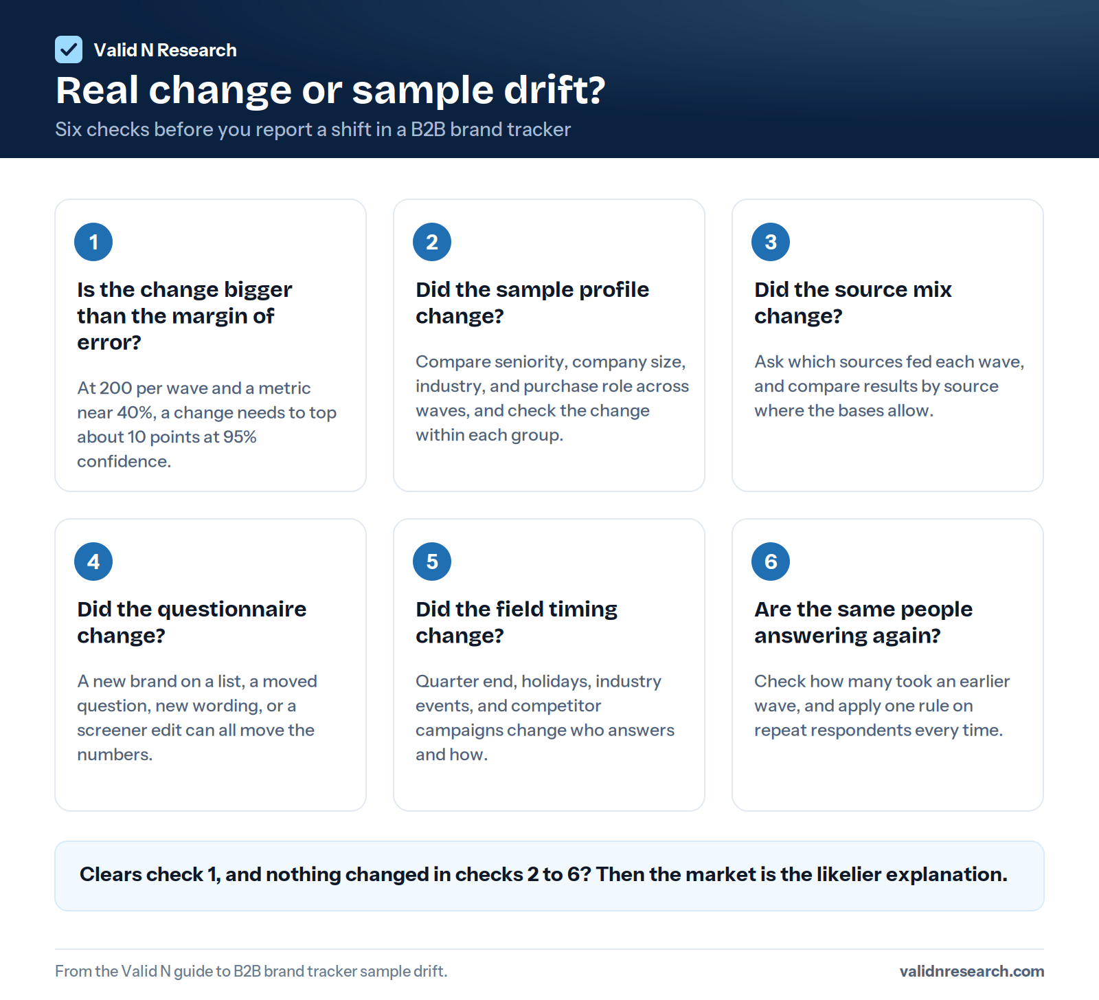
1. Is the change bigger than the margin of error?
The margin of error for a difference between two waves is larger than for either wave alone. For a metric around 40%, with each wave a separate sample:
| Respondents per wave | At 95% confidence, a difference needs to be larger than about | At 90% confidence |
|---|---|---|
| 100 | 14 points | 11 points |
| 150 | 11 points | 9 points |
| 200 | 10 points | 8 points |
| 300 | 8 points | 7 points |
The bar is a little lower for metrics further from 50%. For a metric around 20%, two waves of 200 need a difference of about 8 points at 95% confidence.
Some teams agree to read small B2B trackers at 90% confidence as a directional standard, because the audience makes larger waves impractical. That's a reasonable choice if it's agreed in advance and stated in the report, as long as everyone accepts that, when nothing has actually changed, about one comparison in ten will still look significant.
A six-point drop between two waves of 200 is within normal variation at either standard. It might be real, but the data alone can't show it. The margin of error calculator gives the figure for your own bases.
2. Did the sample profile change?
Put the profile of both waves side by side: seniority, company size, industry, region, role in purchasing, and any other variable that drives the metric. If the latest wave has fewer enterprise respondents or fewer final decision makers, a lower awareness score may be the mix, not the actual market.
A useful test is to look at the change within each group. If awareness is flat among enterprise respondents and flat among mid market respondents, but down overall, the drop points to the mix, not the market.
3. Did the source mix change?
Ask the supplier for the sources used on each wave, at least at category level: their own panel, partner panels, and any other recruitment. If a wave drew more heavily on a new source, compare results by source where the bases allow it.
4. Did the questionnaire change?
Small edits have large effects on trackers:
- Adding a brand to an aided awareness list changes how respondents answer about the others.
- Moving questions, especially putting brand questions after a section that mentions competitors.
- Changing wording, answer scales, or the order brands are shown in.
- Changing the screener, even by clarifying a definition.
Keep the questionnaire under version control, and log every change against the wave in which it first appeared.
5. Did the field timing change?
A wave that fielded at the end of a quarter, over a holiday, or during a major industry event may reach a different mix of people and catch them in a different frame of mind. The same is true for a wave that ran while a competitor's campaign was at its peak.
6. Are the same people answering again?
Check how many respondents in the latest wave took an earlier one. If the share changed, conditioning may explain part of a rise in awareness. Decide on a rule, such as excluding anyone who took the tracker in the last two waves (assuming the audience is large enough), and apply that exclusion on each wave.
Designing a tracker that stays comparable
- Lock the qualification criteria and definitions before wave one, and change them only with a plan for bridging the trend. You can still rotate the wording of knowledge checks and trap options between waves, so repeat respondents can't learn the answers, as long as the qualification criteria stay the same.
- Set quotas on the variables that drive the metrics, usually company size and seniority, and hold them from wave to wave. Interlocking quotas on both are better than separate ones, if the audience allows it.
- Control and document the source mix. Agree on the sources in advance, ask for the mix on every wave, and ask to be told before it changes.
- Set a repeat participation rule, such as a minimum gap between waves for any one respondent, and apply it consistently.
- Field at the same point in the calendar each wave where you can, and for a similar length of time.
- Apply the same quality checks every wave, and keep each wave's rejection log. A wave with far more or far fewer removals is worth a closer look.
- Weight to fixed targets if quotas can't hold the mix exactly, and report how much weighting was needed. Heavy weighting reduces the effective sample size, which widens the margin of error.
When the sample did change
Sometimes the checks show the sample moved. The options, roughly in order of preference:
- Weight the wave to the profile of the earlier waves, and report both the weighted and unweighted results so readers can see the effect.
- Report the change within groups rather than the total, where the bases allow it.
- Footnote the change in the trend chart, so nobody reads a break in the sample as a break in the market.
- Run a parallel wave when you're intentionally changing suppliers or sources. Field the old and new side by side, measure the difference, and use it to bridge the trend.
Changing suppliers mid-tracker without a parallel wave is one of the quickest ways to lose a trend line. The new data may be better, but it won't be comparable with earlier waves.
Reading small bases honestly
When each wave is small, a few habits prevent overreaction:
- Use rolling averages, such as combining the last two waves, for the headline trend.
- Show significance on wave-to-wave changes, so readers can see which moves are real.
- Report direction over several waves rather than any single change.
- Separate what the tracker can measure from what it can't. A quarterly tracker of 150 IT decision makers can show a shift that holds across several waves, especially once the cumulative movement is comfortably larger than the roughly 11 points a single wave-to-wave comparison needs. It can't reliably show the effect of a single month's campaign.
What to ask a supplier before a tracker starts
- Which sources will be used, and will you tell us the mix on every wave?
- Will you tell us before the source mix changes?
- How do you handle respondents who took an earlier wave?
- Will the same screening and quality checks run on every wave?
- Will each wave come with a rejection log?
At Valid N, every respondent goes through the same pre-screen on every wave. Our own panel members re-verify their work email every 90 days. A description of the supply sources used on your project is available on request, at category level. See our data quality page for how the checks work, or send us the tracker brief for feasibility across waves.
Related guides
B2B concept test sample size
What 100, 200, and 300 per cell buy you, and how to design around a small, expensive audience.
Read the guideHow to prevent survey fraud and AI bots
AI agents and fake decision makers, a layered defense, false positives, and what to ask any supplier.
Read the guideB2B sample buyer's guide
How to brief a sample vendor, what to ask at feasibility, and the contract clauses that protect your data.
Read the guideB2B brand tracking: frequently asked questions
Why did brand awareness drop between tracker waves?
Either the market changed, or the sample did. Before concluding the market moved, check whether the change is larger than normal sampling variation, and whether the sample profile, source mix, questionnaire, field timing, or share of repeat respondents changed between waves.
How do I know if a change in a brand tracker is significant?
Compare it with the margin of error for a difference between two waves, which is larger than for either wave alone. At 95% confidence and a metric around 40%, a difference needs to be larger than about 14 points at 100 per wave, 11 at 150, 10 at 200, and 8 at 300.
What causes sample drift in a tracking study?
Changes in who answers: a different mix of seniority, company size, or industry; a change in sample sources; more or fewer repeat respondents; or a wave fielded at a different time of year. In small B2B audiences, any of these can move a metric as much as a real market shift.
How large should each wave of a B2B brand tracker be?
Large enough that the changes you care about are bigger than the margin of error for a difference between waves. At 200 per wave and a metric around 40%, differences under about 10 points are within normal variation. If smaller moves matter, use larger waves or rolling averages.
Should the same respondents take every wave?
In a narrow B2B audience, some overlap is unavoidable, but repeated exposure to the same brand list can raise awareness. Set a repeat participation rule, such as excluding anyone from the last two waves, and apply it every time.
How often should a B2B tracker field?
As often as the metrics can realistically change and the audience can support. Many B2B trackers field quarterly or twice a year. Fielding more often in a small audience increases repeat participation and, for the same annual budget, makes each wave smaller.
Can I switch sample providers in the middle of a tracker?
You can, but plan for it. Run the old and new providers side by side for at least one wave, measure the difference, and use it to bridge the trend. Switching without a parallel wave usually breaks comparability.
Should I weight tracker data?
Weighting to fixed targets helps keep waves comparable when quotas can't hold the mix exactly. It has a cost: it can inflate the influence of a small subgroup and widen the margin of error. Report how much weighting each wave needed, because heavy weighting reduces the effective sample size.
Send the spec. Get real numbers back.
Audience, market, target n, expected interview length. Feasibility the same business day for standard audiences, with reachable counts, an estimated qualification rate we believe and a quoted cost per complete that stays fixed for the agreed brief.